Proof of Concept
Open Canvas
Reimagining an automotive brand's web experience
Overview
I led the concept, design and UX for Open Canvas, an experimental web experience that delivered personalized, lifestyle-focused content to both new and returning users. The project earned praise from the brand's CMO and positioned our agency as a strategic partner.
01. Context
"If you could redesign our brand website, what would you do?"
This is the bold and open-ended question our client posed to us. Show us something we've never seen before. Something that makes vehicle shopping exciting and keeps current customers coming back for more.
02. Research
Gathering insights
To design this experience, I investigated how users browse, compare, and shop for vehicles. Research revealed common frustrations that prevented users from finding what they needed quickly and confidently. These pain points became the foundation for the design approach:
Too Many Options
Comparing trims and models took too long and was confusing.
Incomplete Info
Details were buried or missing entirely. Users were left guessing what each vehicle offered.
Confusing Pricing
Hidden fees and murky financing made it hard to confirm costs.
Fragmented Flow
Unexpected transitions from browsing activity to action.
Impersonal
Same forced, linear experience regardless of first-time visit or returning user.
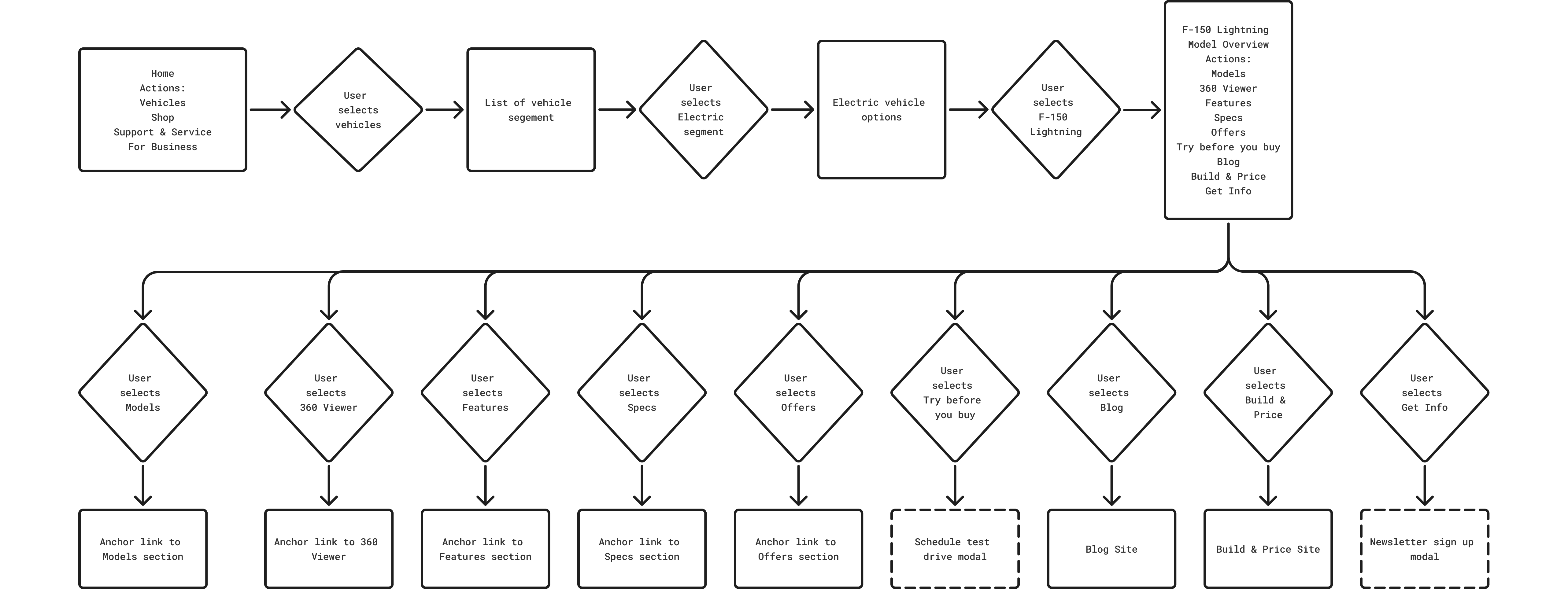
After identifying key user pain points (and experiencing many of them myself as a vehicle owner) I started digging into the existing user flow. Even basic vehicle research proved time-consuming and frustrating.
Analytics showed most users rely on the main navigation to start their search. From there, multiple clicks were required just to reach a vehicle overview page. Once there, the research experience became even more challenging. Eight secondary navigation links looked nearly identical, yet some were anchor links while others opened entirely new pages. Labels were unclear (what's the difference between "Specs" and "Features"?). The "Models" section, despite being the first nav item, sat halfway down the page. And choosing between trims was difficult, with little explanation to justify significant price differences.
For users who chose to scroll instead, the sheer volume of content felt overwhelming. And if their needs changed mid-journey, such as switching from a truck to an SUV, they were forced to restart the process from the beginning.
Current user flow
Understanding user goals
These findings led to the next question: what are users actually trying to find? To answer this, I looked deeper into user goals based on their relationship with the brand, identifying two user groups: new or research-phase shoppers and existing or returning owners.
Then, I mapped priorities to representative vehicles using the F-150 Lightning to reflect users in the research phase and the Bronco for existing customers. I organized these priorities into content categories, to help create the framework for the experience and content strategy.
User goal mapping
Unauthenticated user - F-150 Lightning
What are users looking for?
Range/Charging
- EPA estimated range
- Charging speed (Level 1, 2, DC fast)
- Home charging setup costs
- Public charging network availability
Work Integration
- Job site power needs
- Tool charging capability
- Generator replacement
Lifestyle
- Seating capacity
- Cargo space vs gas F-150
- Road trip viability
- Accessories
- Trim (aesthetics)
Home Setup
- 240V outlet installation
- Ford Charge Station Pro
- Electrician costs
Weather Impact
- Cold weather range loss
- Preconditioning benefits
- Winter driving performance
Cost
- Purchase price vs gas equivalent
- Federal tax credits
- State and local incentives
- Lower maintenance costs
- Electricity vs gas costs
Reviews
- Professional road tests (Car & Driver, MotorTrend)
- Owner forums and communities
- Recall history and software updates
- Dealer service network quality
Authenticated user - Bronco owner
What are users looking for?
Accessories
- camping gear
- outdoor gear
- wheels
- interior
- apparel
Lifestyle
- how influencers use their bronco
- maximizing features of their vehicle
- Team Bronco
- Bronco Experiences
Adjacent vehicles
- potential second vehicle purchase
- another Ford that fits their lifestyle
Re-purchase
- Trade-in/upgrade
- lease ending
- new model information
Safety
- Recalls
- warranties
03. Ideation
Shaping the experience
With the pain points and goals defined, I began exploring how the new experience should function. My goal was to support discovery, research, and decision making without forcing users down a fixed path.
I looked at innovative digital experiences across both automotive and non automotive brands, and focused on interaction patterns that gave users more control over how they explored content and products. The most compelling examples allowed users to shape their own journey.
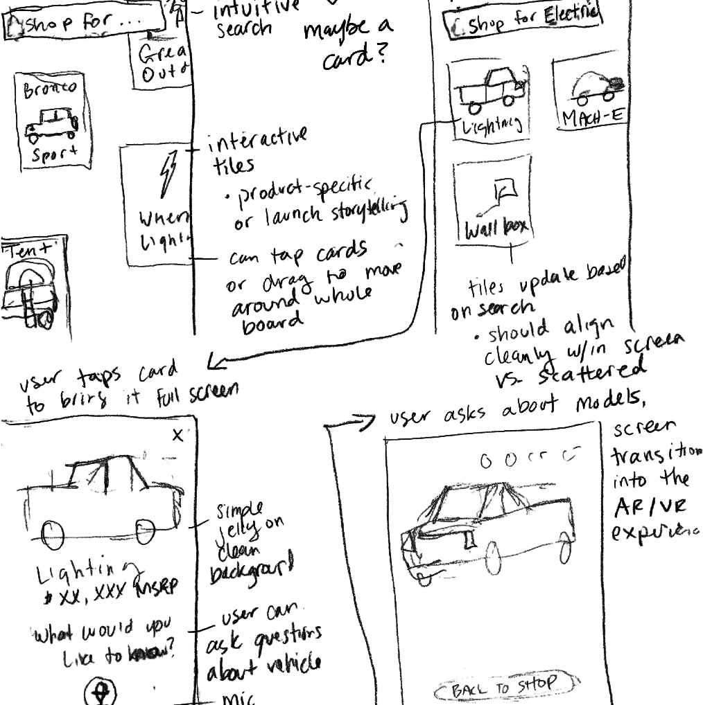
I then moved into ideation with paper sketches. Sketching is always my favorite way to start as I can quickly get ideas down. Once I felt I had a solid path defined, I created a new user flow that supported both unauthenticated and authenticated users.
Initial sketches
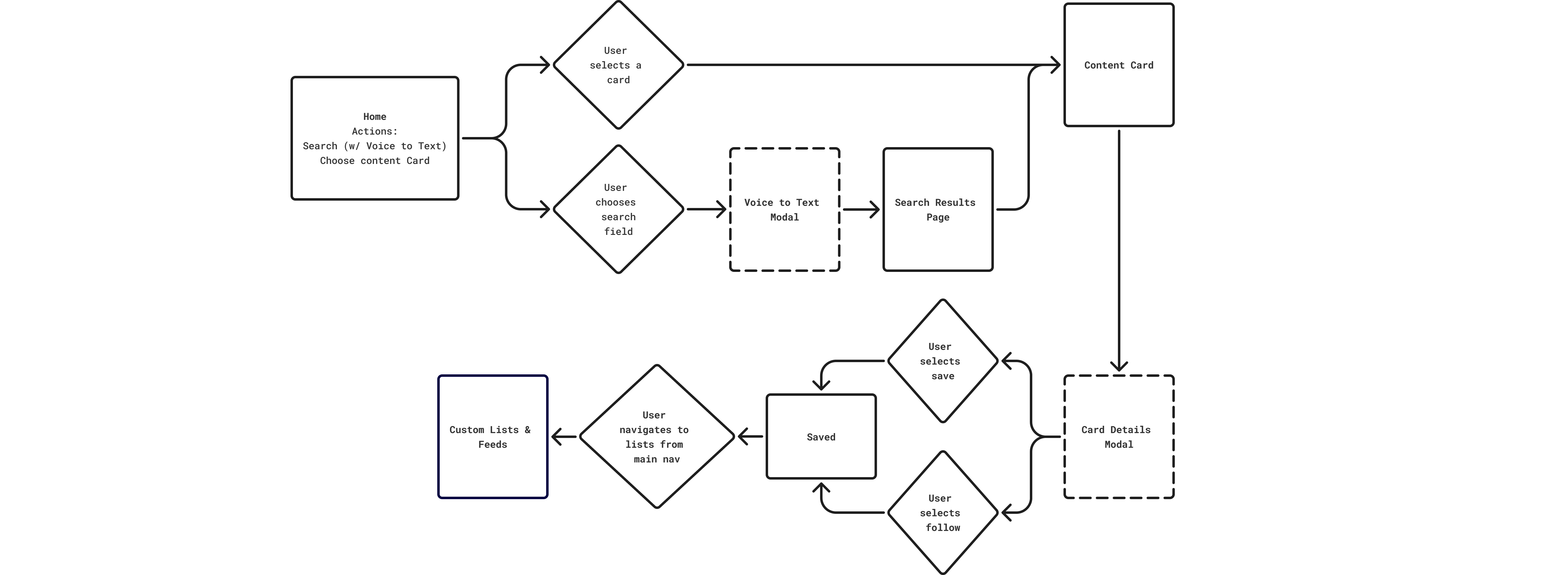
New user flow
Key screens and decisions
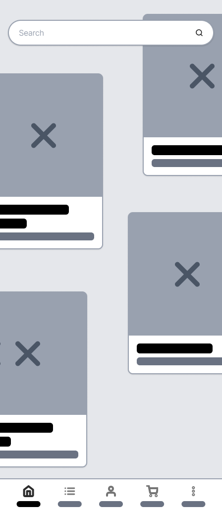
Exploratory homepage
Design Intent: Let users explore freely without a fixed path.
What This Solved: Created a more personal, exciting experience for both new and returning users.
- Card layout supported open browsing.
- Rotating content introduced new products to visitors.
- Returning users saw content based on saved or important items.
- Prominent smart search enabled quick entry.
- Voice input allowed natural language queries.
- Reduced reliance on traditional navigation.
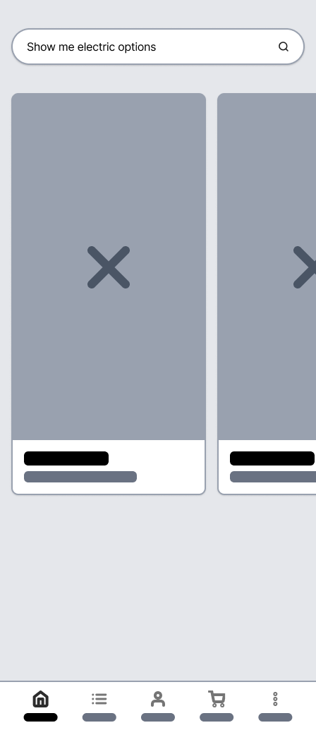
Smart search capability
Design Intent: Help users find relevant information quickly.
What This Solved: Users reached the content they wanted faster and saw complete details.
- Screen updated with relevant content cards.
- Clean layout supported fast scanning.
- Users could continue searching or access card content.
- Consistent interaction with cards across the experience.
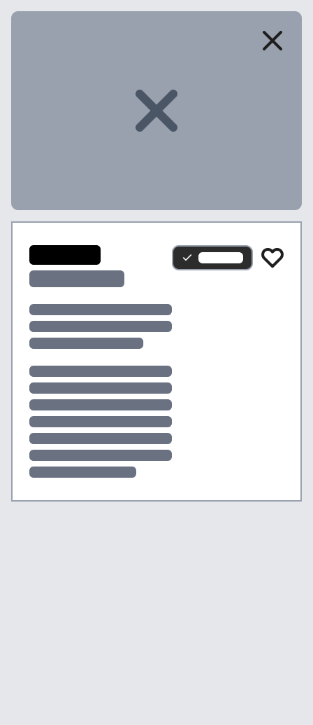
Focused content modals
Design Intent: Use one consistent structure for research and comparison.
What This Solved: Made key vehicle details easy to find, reducing confusion from missing information.
- Cards contained content that best matched user input.
- Opened in modals to preserve context.
- Users could save cards or follow topics.
- Supported quick exploration without full page transitions.
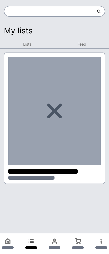
Content collection
Design Intent: Let users save content that matters to them for later.
What This Solved: Made it easy for users to return to relevant information and pick up where they left off.
- Separate tabs for saved items and followed topics.
- Personalized experience for returning users.
- Account creation enabled saving progress.
- Supported ongoing exploration and repeat visits.
Quick access navigation
Design Intent: Keep top-priority actions accessible while maximizing content space.
What This Solved: Reduced noise in the main content area so users could browse without distraction.
- Persistent native-style navigation replaced an intrusive top nav.
- Prioritized home, saved content, profile, and cart.
- Overflow menu handled secondary destinations.
- Maintained focus on content and exploration.
New flow wireframes
Exploratory Homepage
Search Results
Card Details
Saved Items
04. Result
From insights to impact
By leveraging research and insights, the design turned browsing into a personalized experience. Smart search helped users find exactly what they wanted, new users could explore freely, and returning users saw content tailored to their past activity. Favorites, custom lists, and refreshed content made it easy to compare vehicles, save what mattered, and make decisions faster. The experience exceeded Ford's expectations and reinforced our role as a trusted partner.
First time visitor
Return or authenticated visitor
“A+. I haven't been this excited at Ford in a very long time. The concept elevated the discussion well-beyond design elements and experience, challenging how Ford should embrace a lifestyle-based approach across marketing.”
— Suzy Deering, Ford Global Chief Marketing Officer