Design System
Sparkline Design System
A scalable component library built for speed and consistency
View Sparkline StorybookOverview
I led the creation of the Sparkline Design System to unify the bank's digital products under a single architecture. My goal was to move the organization away from isolated, redundant workflows and toward a scalable foundation. By integrating design and engineering through a shared token system and an automated delivery pipeline, I reduced technical debt and created a consistent experience for our customers. This system served as the foundation for our award-winning online account opening application, demonstrating the direct impact of architectural rigor on product quality and business success.
01. Context
Stop reinventing the wheel.
The bank's digital presence had grown organically across multiple platforms, leading to significant inefficiencies. Different teams solved the same UI problems in isolation, which caused visual fragmentation and functional inconsistencies. I identified five core barriers that hindered our speed and quality:
Fragmented Source of Truth
Designers and engineers lacked a shared reference, making handoffs unreliable.
Visual Inconsistency
Hardcoded values and ad-hoc spacing prevented a cohesive brand experience.
Low Efficiency
Engineers frequently rebuilt common components, which slowed down development sprints.
Technical Debt
Duplicated logic made product updates risky and difficult to maintain.
Accessibility Gaps
A lack of shared standards resulted in inconsistent ARIA and keyboard support.
02. Foundations
A baseline for clarity and cascading.
To solve these issues, I designed a tiered token system for color, typography, spacing, and radius. By separating raw values from their semantic intent, I created a scalable structure where foundational updates propagate through the entire library.
I architected this system to serve as the common language between design and code. My naming convention ensures that the intent of every token is clear to designers in Figma and engineers mapping values in their stylesheets.
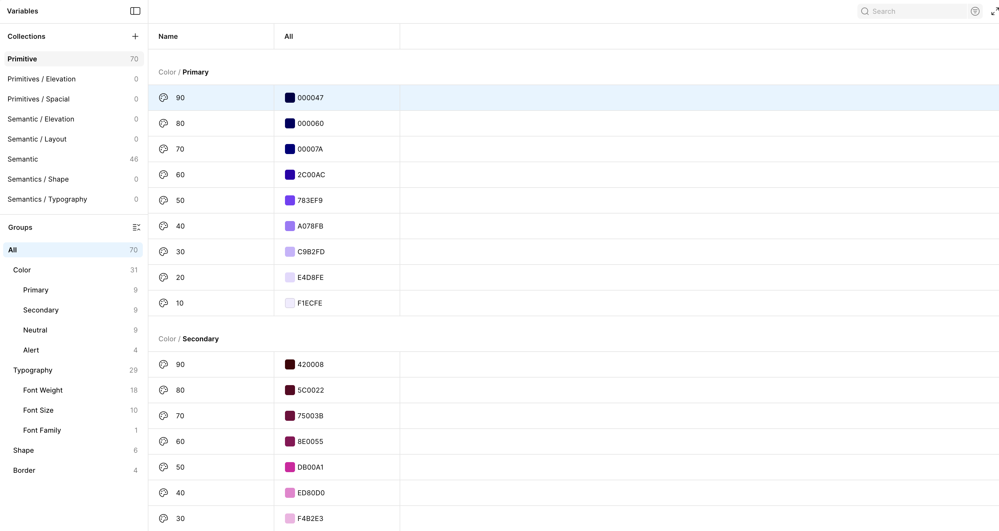
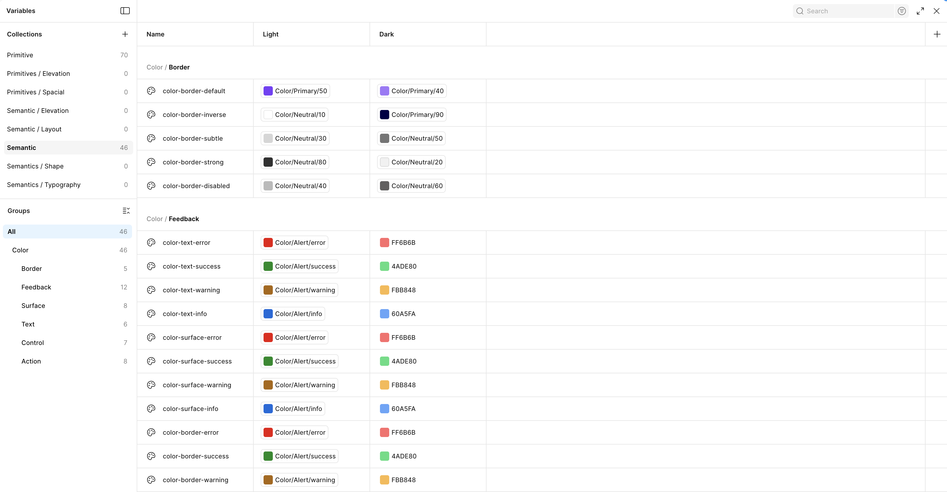
* Images show color tokens. The full token system also covers typography, spacing, and radius.
03. Components
Built once. Used everywhere.
With the token foundation established, I built the component library by composing primitives into complex UI elements. I designed each component with variants that map to real product states, including default, hover, focus, disabled, and error.
Every component is wired for light and dark mode. Because values resolve through semantic tokens, switching themes happens automatically.
I utilized Figma properties to allow product designers to adjust size, style, and state without needing to detach or rebuild components.
I built behaviors directly into the components. By embedding hover states, focus rings, and open/close interactions, I enabled product teams to build accurate prototypes without manual effort.
04. Design to Code
From frame to function.
I architected an automated pipeline using Claude Code and Figma to eliminate the traditional "translation" phase of handoff. Instead of writing manual specifications, I used the Figma MCP integration to feed design frames directly into Claude Code.
This process used the component structure, token values, and logic defined in Figma to generate functional Angular components. This approach ensures that the design intent is preserved and that design and code remain synchronized from the first commit.
Using the Figma MCP integration, I fed design frames directly into Claude Code to generate functional Angular components, eliminating the traditional handoff translation phase.
05. Living Documentation
The right tool for the job.
I implemented Storybook to ensure components remained discoverable, testable, and reliable.
Every component in the library includes a story that demonstrates its range of variants. By integrating MDX documentation directly alongside the code, I provided a single location for engineers to verify behavior. Storybook became the primary reference tool that kept design and engineering aligned throughout the development lifecycle.
Every component ships with a story covering its full range of variants and states, giving engineers a single source of truth for behavior and usage.
06. Chromatic
Where design and code stay connected.
I integrated Chromatic to manage visual quality and maintain the connection between Figma and code.
Visual Regression. Every pull request passes through an automated visual pipeline. This captures screenshots of every component, surfacing changes for review before they reach production. This allowed product designers and owners to verify work against the intended design.
Chromatic captures screenshots of every component on every pull request, surfacing visual regressions for review before they reach production.
Figma Integration. Using the Storybook Connect plugin, I linked Figma components directly to their corresponding code stories. This enables developers and stakeholders to view live components, inspect code, and access documentation directly from the Figma interface, removing the need to switch between tools.
The Storybook Connect plugin links Figma components directly to their live code stories, letting designers inspect behavior and documentation without leaving Figma.
07. Result
Industry Recognition
The Sparkline Design System was first deployed to support the bank's new online account opening application. By utilizing the pre-built, tested components and the automated handoff pipeline, the team accelerated the delivery of this product.
This application was recognized by The Digital Banker as the Best Digital Account Opening Solution - North America at the 2025 Global Retail Banking Innovation Awards. The judging panel noted that the innovation transformed how customers access savings products, successfully meeting the expectations of digitally driven customers while building a robust infrastructure for future product digitization. This project validated the design system as a critical business asset that drives both operational efficiency and award-winning user experiences.