Brand Strategy & UX
T-Mobile Rewards
Rethinking what a wireless rewards program could be
Thank YOUtopia, a rewards program built around you
A new name, story and experience for T-Mobile's rewards program: a personalized world of benefits that meets customers where they are.
Overview
T-Mobile wanted to overhaul their rewards program from the ground up. The ask was to define not just a new feature set, but a new brand position that would make the program feel meaningfully different from what competitors were offering. I led the design effort from research through creative direction, delivering Thank YOUtopia: a new name, story and experience for how T-Mobile could own this space.
01. Brief
A program in need of a point of view.
T-Mobile's existing rewards program had accumulated features over time without a clear strategic spine. The benefits were real, but the experience of discovering and redeeming them was disjointed. There was no narrative connecting what T-Mobile offered to why a customer should care.
The goal was to find that narrative, and design around it. What should T-Mobile's rewards program stand for? What would make it feel like T-Mobile, and not just another points program?
02. Research
Look everywhere but at the competition first.
I started with a competitive audit of major rewards programs, both within wireless and across other industries. The goal wasn't to copy what was working elsewhere, but to identify the patterns worth keeping, the gaps worth filling, and the ideas worth borrowing from entirely different categories.
For each program I catalogued the full experience: unauthenticated and authenticated web, mobile app, and the underlying feature set. I then mapped out the standout observations and flagged the features most worth bringing into T-Mobile's context.
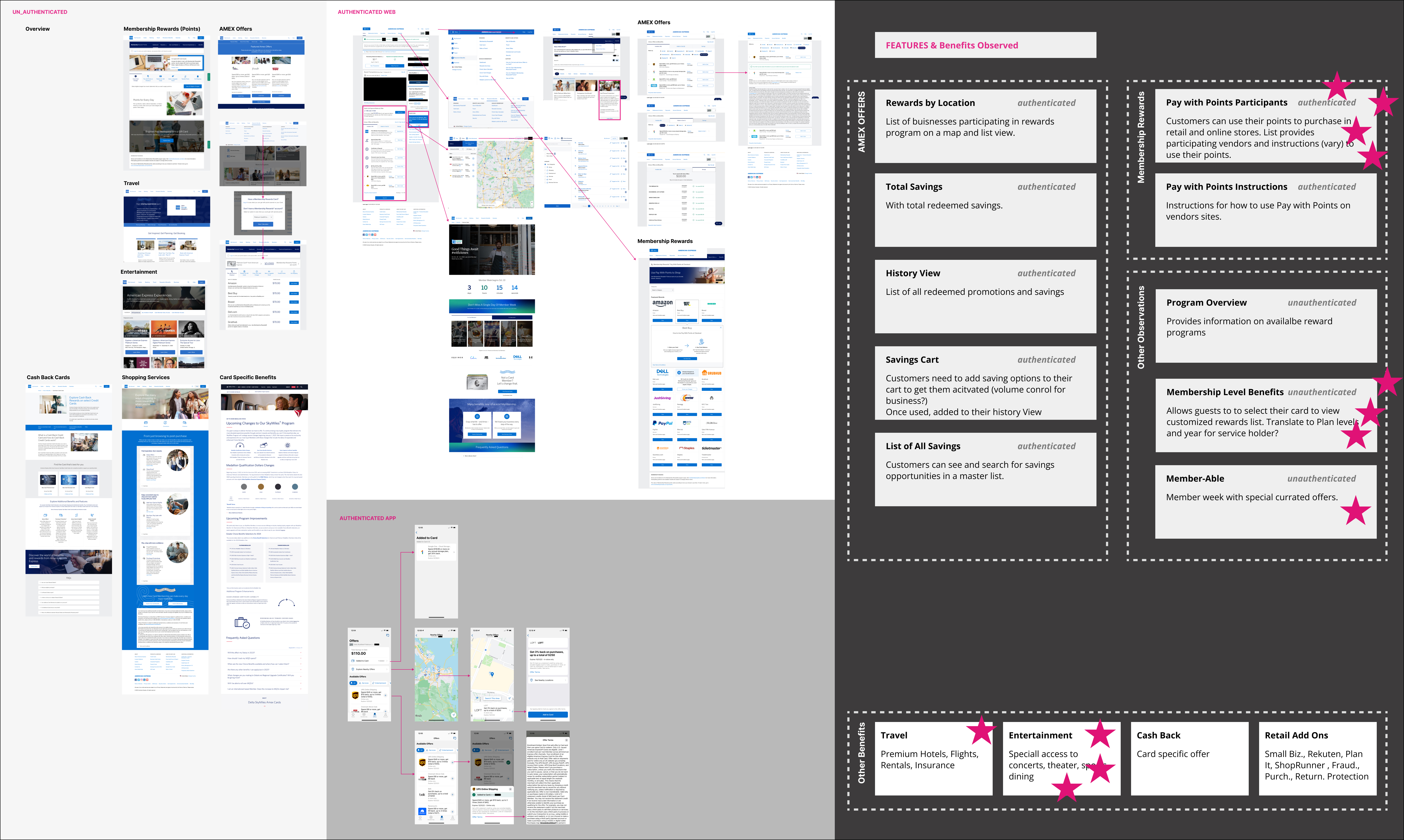
What stood out.
Across programs, a handful of features kept surfacing as high-value. Location-based offers, transparent redemption paths, tiered membership benefits, and curated access to entertainment and travel were the areas where programs earned the most loyalty. These became the foundation for what T-Mobile's program should include.
Location-Based Offers★
Businesses participating in the rewards program surfaced on a map and list view, making discovery feel immediate and local.
Membership Level Benefits★
Tying benefit access to plan or tenure level creates meaningful differentiation and a reason to stay.
Entertainment Access★
Special access to concerts, dining, and theater. A benefit category with real perceived value that few programs do well.
Member-Able Moments★
A dedicated member week with curated offers gives the program a recurring calendar moment to rally around.
Savings History
A running total of redeemed savings reinforces the value of membership over time.
Pay with Points
Letting customers apply points at participating retail and online stores increases redemption frequency.
Travel Benefits
Premium hotels, flights, rentals, and insurance as part of the rewards ecosystem. High-value perception, even at low redemption.
Retail Add-Ons
Partnerships with ShopRunner, Rakuten, and fraud protection services that extend the program beyond the core product.
Savings Cart
Customers activate savings into a cart before purchase, creating intentionality around redemption.
Mapping features to the journey.

With the best features identified, I mapped them against the full customer journey to understand where each one belonged. This helped prioritize which features had the most impact at each stage and ensured the program would feel relevant at every touchpoint, not just at sign-up.

The authenticated experience.
After onboarding, the opportunity shifts. Once a customer is active, benefits need to surface naturally within the app, not buried in a separate rewards tab. I mapped where and how these features could live across the home screen, bill, account, and more sections of the existing T-Mobile app.
03. Concept
A place where every customer feels seen.
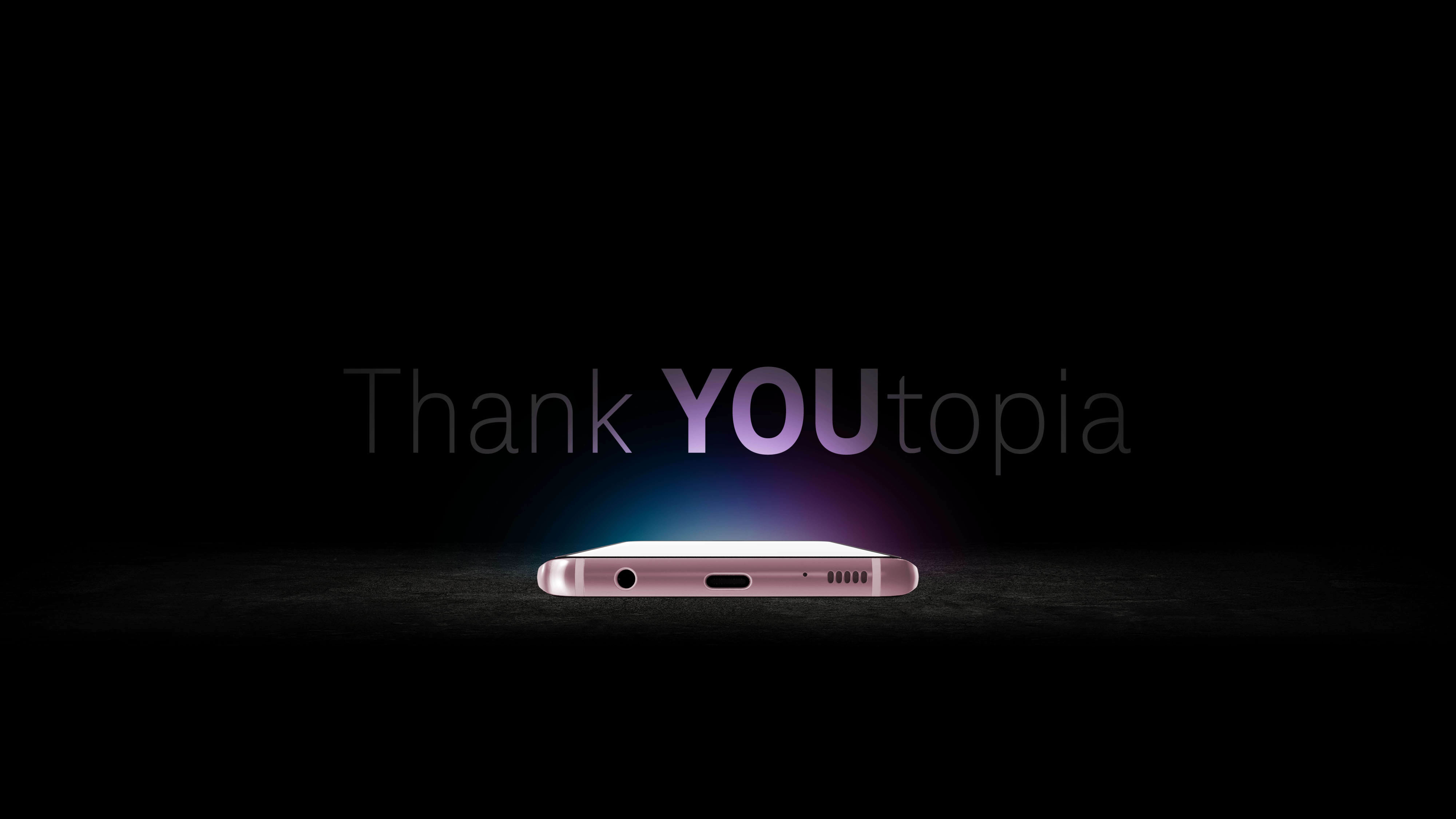
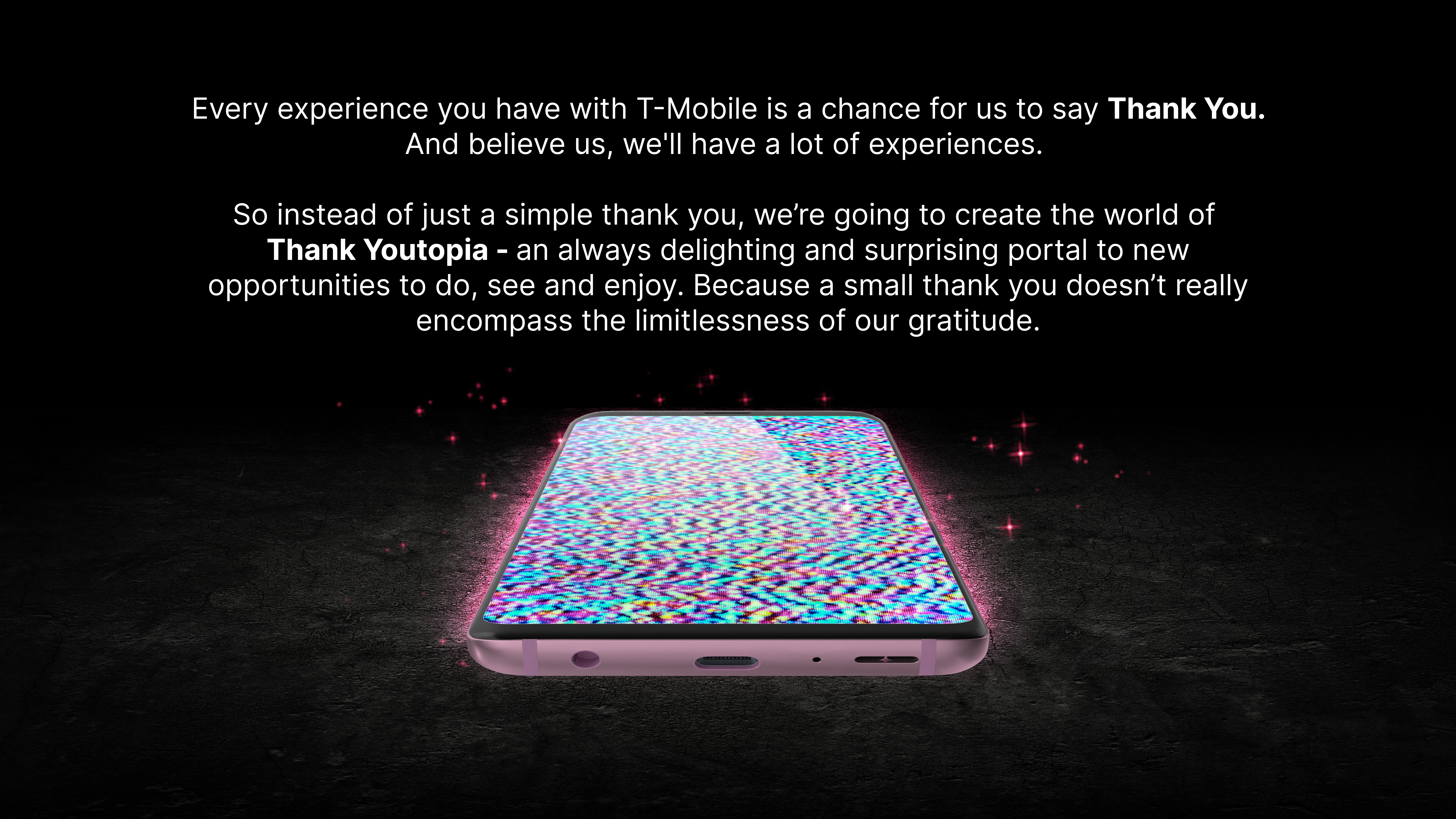
The research pointed to one idea: the programs customers valued most made them feel like the program was built for them. Thank YOUtopia turned that into a brand position. Every experience with T-Mobile becomes a chance to say thank you, and the rewards program becomes a personalized world built around the individual.
The program would meet you where you are, surface offers that match your life, and feel genuinely grateful for your membership. Warm, inclusive, and deeply personal.
04. Result
A name, a story, and a plan to build it.
T-Mobile moved forward with Thank YOUtopia. Its warmth, personalization, and customer-first positioning fit a program meant to build loyalty over time.
The research showed that the most valuable features across competing programs had one thing in common: they made customers feel like the program was built for them specifically. Thank YOUtopia gave T-Mobile a name, a story, and a strategic foundation to build that experience.
The strategic work landed just as well. The feature-to-journey mapping gave stakeholders a clear picture of what the program should include and why, and the authenticated app analysis showed exactly where and when benefits should surface across the existing experience. Both artifacts shaped the conversation around what to build, not just what it should look like.